New Visualization tools in Oracle Business Intelligence 11g:
Most of you must have used the new visualization tools available as part of Oracle BI foundation suite. However, I placed the content here for the new bies :
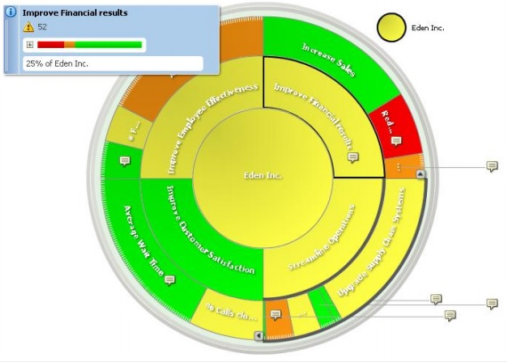
Contribution Wheel: The Contribution Wheel is a new visualization available with the Oracle Scorecard and Strategy Management product, a part of the Oracle Business Intelligence Foundation Suite. It is a variation of the Scorecard Strategy Tree document type, and is an example of a space-constrained, hierarchical visualization. One of its unique advantages is that it makes it possible to view the relative weights assigned to a KPI or objective. At a glance, it is possible to see not only how much weight a particular KPI or objective contributes within its siblings at the same level, but also how much the specific KPI or objective contributes to the overall performance. This view is available as a rich, interactive visualization on desktop browsers as well as on mobile devices, where it supports touch and multi-touch gestural interactions.
Trellis views, also known as multi-panel visualizations, or grid-of-charts, are ideal for visualizing large datasets as well as multivariate data. Each cell in the grid can bevisualized as a microchart. A wide choice of visualizations is available to be used as these embedded visualizations. Both microcharts as well as traditional visualizations can be used. To make it easier for users to create these Trellis views, a choice of Simple and Advanced Trellis views is offered. These Trellis views are first-class views within the product, and therefore can participate in the full life-cycle of other views, and be published to Dashboards, and support drills, master-detail eventing, Actions, filters, scheduling, and more. And like other views, Trellis views are available as interactive views on the new Oracle BI Mobile app.
Micro Charts: A critical component of Trellis views in Oracle BI are the microcharts available. The types of microcharts available in Trellis views are SparkLine, SparkBar, and SparkArea. Microcharts are highly condensed graphics, and are very useful in visualizing the trend of a particular metric over time, across one or more dimensions. Trellis view microcharts support the ability to highlight the start, end, minimum, and maximum values. Trellis view microcharts support formatting and setting the size of the microchart, the color of the line or bar or area, etc… An intuitive layout editor facilitates quick customization of the
views via drag-and-drop actions
Original Document:http://www.oracle.com/us/solutions/ent-performance-bi/business-intelligence/new-in-oracle-bi-11g-1708050.pdf
Line & Route Geo-Spatial Visualizations: Geo-spatial visualizations as first-class views in the BI suite. Apart from visualizing and formatting shapes and points, map views now support visualizing line also. Typical examples of line geometries include airline routes, rail traffic, highways usage, or even hurricane paths. These line geometries can be formatted using a point-and-click interface in Map Views, and a rich palette of colors is available for users to segment their data on. Users can combine shapes, points, and lines on the same map. For example, a color-fill can be used to display data at the state level, color-coded lines to format highway traffic for different state highways, while points can be used to format the toll collection at different toll booths across the highways. As with other views, users can click to get rich tooltips, drill, invoke master events, and Action Links on map view formats.
Additional Info via Feature Themes: Map views, as geo-spatial visualizations in Oracle BI are called, now support displaying non-BI information. It is very useful at times to bring in and display additional information on a map; information Not all information is available in a data warehouse that a BI system reports on. Sometimes additional context is useful to have.
For example, when looking at retail store sales on a map, it would be useful to include a heatmap of income or demographics on the same map. Any number of such “feature” themes, can be included in map views, using a point-and-click interface. End-users can show or hide these layers with a click
Optimized and Available on Tablets: All these visualizations, like other views in Oracle BI, are also available on the Oracle BI Mobile app, without requiring any rewrite. These visualizations are optimized for interactions via touch and multi-touch gestures.